i play a lot of pick-up hockey, and the only real "rule" is to bring a light & dark jersey. teams are made on the spot. i'm not too fond of wearing my "gamer" (the brown & gold, or the navy) Invaders jerseys as i don't want them to wear out. but i LOVE the Invaders theme/name.
i already have a white pick-up jersey:
in fact, here i am wearing an earlier version of the white just before a shinny:
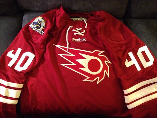
so now i needed a dark! i wanted something totally different from what we've seen from the Invaders to this point. i wanted a SUPER classic & simple design. almost to look like it would have been a throwback from... say... the 40's-50's. errr something like that. but still tied to the Invaders style
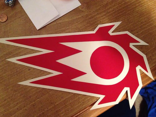
so i simplified our shoulder patch. turned it into a 2-color scheme of a logo:
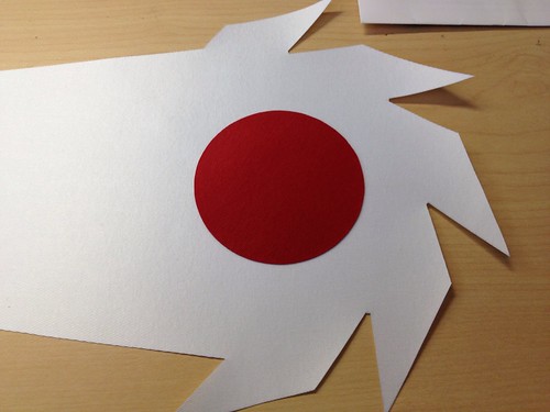
re-sized, traced, and so-on:
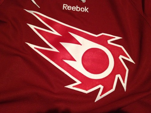
slapped it on the front of the jersey:
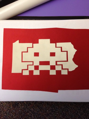
i tried to do something with our other shoulder patch, but it just wasn't working. enjoy anyway:
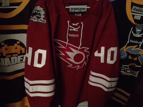
finished front:
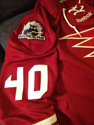
first time i ever tried sleeve numbers. also, used our current logo shoulder patch almost as if to say "no matter how different, this is still a 'Vaders jersey"
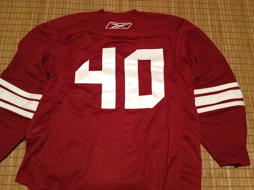
simple back. current numbers font, no outline. clean!
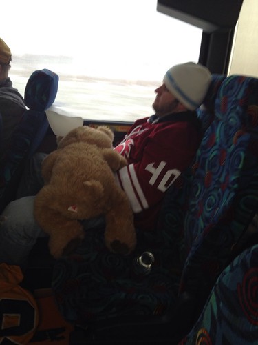
here i am wearing it the next day, for the first time... passed out on a bus trip to Buffalo to see the Penguins take on the Sabres. too... much... beer...
welcome to "the family"


2 comments:
That thing looks NICE! I love the throwback design and you nailed it.
thanks TQ! working on any projects?
Post a Comment