Friday, July 13, 2012

Dabbling in Sign Painting 3...

progress!

look good so far:

Untitled 


Untitled 


Untitled

ehhh... maybe half way finished? not sure, but stay tuned!

Tuesday, July 10, 2012

Dabbling in Sign Painting 2...

this is the style of letters i'd like to try to resize & recreate with a paint brush:

Untitled 

here are the rest of the colors i'm going to use:

Untitled

Thursday, July 5, 2012

Flag DIY, DDC style...

i've recently became a huge fan of Aaron James Draplin and the Draplin Design Co. Also, i had this really cool looking Sea Foam flag that needed a project. Had some extra  Gold material form my Invaders projects. So i thought i'd add them all together and try something new... a DIY flag!

i took the main DDC logo from the "Freight Train Torso Cover"

merch_freight_train_t-shirt_main

copy, pasted, traced, scaled, and printed in AutoCAD, as i do almost always:
Untitled 

 cut out some temporary templates good for about 2-3 good traces:

Untitled 

sewed:
Untitled

look how much thread i had left... couldn't sew another straight-away! SO close:

Untitled

finished:

Untitled 

check out the scale... do those colors look sharp, or what?!?!

Untitled

Aaron & the DDC gang, hope you enjoy the flag!

to all of you reading this post, find an hour to watch this video of Aaron and his 50 Point Plan! might just change the way you approach a few things in life:

Tuesday, July 3, 2012

Sometimes I Get Awesome Gifts... (From Scheibler)

thank you Will Scheibler! check out what he DIYed, and he even sent me one!

message from Will:

"Thought of making a fake farm team jersey of your Pittsburgh Invaders one for Thunder Bay (where I live). Used your INVADERS logo script and was thinking of either using the 3rd alien you didn't use or the mystery space ship. Maybe since it would be a farm team use the alien you have on the front of yours for the shoulders. I have a black jersey with yellow stripes (like the Bruins from the 80s) that has screen printing on the front I could cover over with a logo.

Incorporated the main geographical thing Thunder Bay is "famous" for - the Sleeping Giant (it's even on the city's flag) , and then added some waves on top. Originally thought of using all the colours in the flag but decided that would be way too much. Anyway, after goofing around for a while here's what I came up with so far"

here is the Sleeping Giant:

sleeping giant 

sleeping giant 2

here is the beautiful Thunder Bay flag:

thunder bay flag 1

i mean really, is that flag gorgeous, or what?!?!

here is the logo Will drew up:

test2_mysteryship_yellow2 

here is the jersey Will DIYed:

will bruins invaders 

icing on the cake... here is a logo he sent to me! really, the camera/pic just doesn't do this logo justice! it's absolutely top notch work:

Untitled

thanks again to the hardest working man in the DIY world, Mr. Will Scheibler!

Monday, July 2, 2012

Dabbling in Sign Painting...

trying something new. always love getting into painting projects. VERY therapeutic

base white, main color is a light yellow:

Paco's Surf Shop Sign 

fun with homemade fonts:

Paco's Surf Shop Sign 

sharp! hopefully i can paint within the lines!

Paco's Surf Shop Sign 

stay tuned!

Paco's Surf Shop Sign

Thursday, June 28, 2012

Ocean City Beach Trip

been to Ocean City MD more than any place on earth not named Pittsburgh. 6 hour drive, it's like a 2nd home to me and my family.

i try not to carry my phone on vacation, but this sunny morning i happend to have it on me... so i snapped just a few pics of some cool boardwalk sinage (that catches my eyes)... and an old friend of mine

enjoy:

OC History Plaque Ocean City 6/2012 

wooden letter goodness:

Fishers Elevated Ocean City 6/2012 

love the colors:

Souvenir City Ocean City 6/2012 

what a cool name for a ride:

Inverter Ocean City 6/2012 

always make it a point to say hi to this guy:

Old Friend Ocean City 6/2012 

this would look better hand painted. as it is, awesome... but a bit TOO perfect. love it anyway:

Awesome Sign Ocean City 6/2012 

like the Fishers sign above, this is what wooden letters are all about:

Fishing Signage Ocean City 6/2012 

anyway... want to see more? hop in the car and take a road trip

ma had a blast too. i mean, who wouldn't... Dumser's and everything...

Untitled

Friday, June 8, 2012

eBay Score... Pencil Tin

snagged this from the clutches of eBay about a year ago. take it on almost every trip!

enjoy:!

front:

Untitled 

rear:
Untitled

juicy middle:

Untitled
everything you need, fits in this tin

and, well... day tripper:

day trip case

product placement, you ask? why yes... yes i did.


this beaut has been keeping me busy for the past 3 weeks or so, filling up with bad sketches.

Untitled

the idea was though up by one of my new favorite designers/design team, Draplin Designs Co.

go check out his story, his work, and his videos... you'll never say "dude" again! that's a good thing

hope you all have a great weekend... fight for the long dogs!

Tuesday, May 29, 2012

Invaders 4!

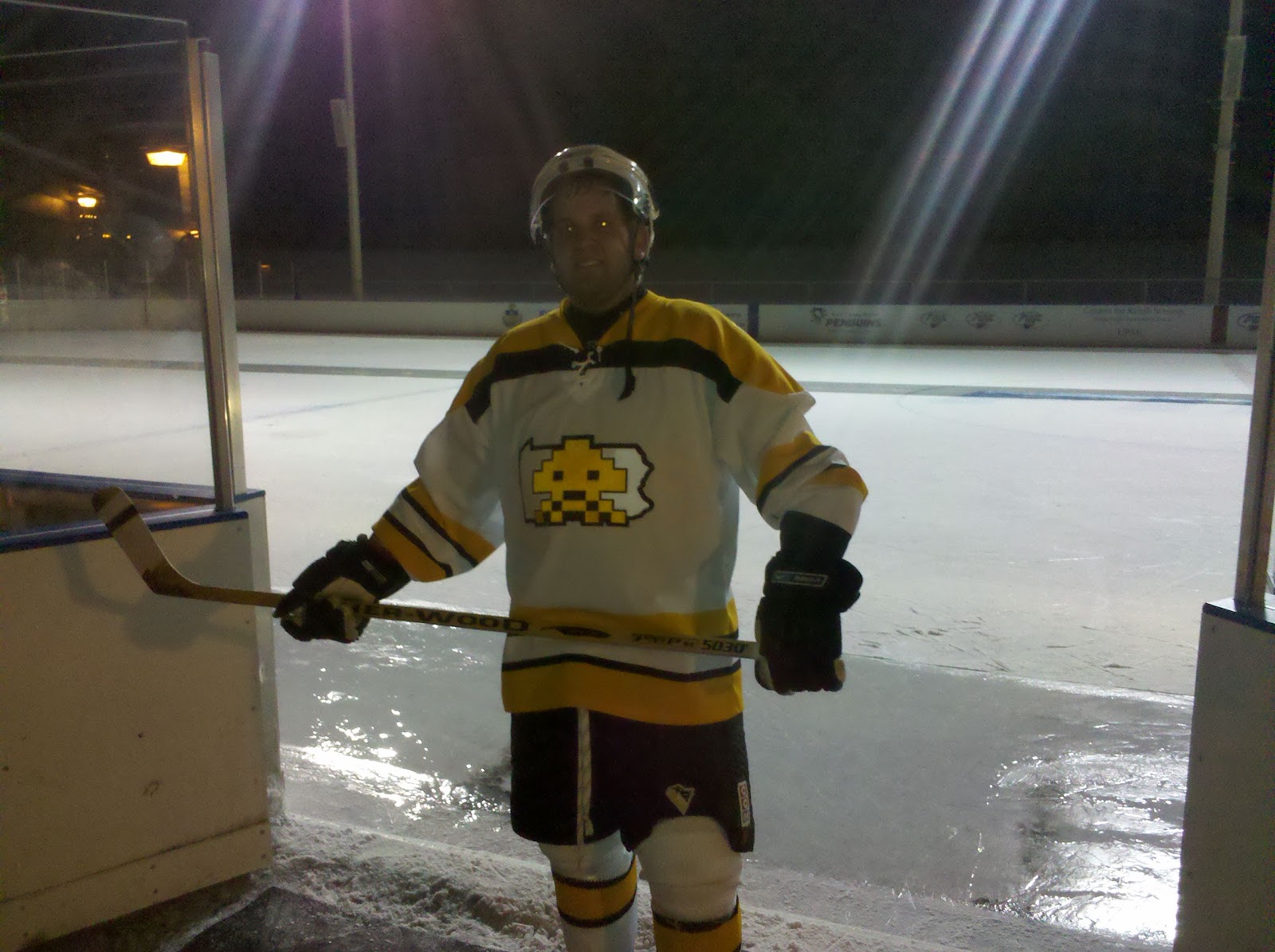
i play a lot of pick-up hockey, and the only real "rule" is to bring a light & dark jersey. teams are made on the spot. i'm not too fond of wearing my "gamer" (the brown & gold, or the navy) Invaders jerseys as i don't want them to wear out. but i LOVE the Invaders theme/name.

i already have a white pick-up jersey:


in fact, here i am wearing an earlier version of the white just before a shinny:


so now i needed a dark! i wanted something totally different from what we've seen from the Invaders to this point. i wanted a SUPER classic & simple design. almost to look like it would have been a throwback from... say... the 40's-50's. errr something like that. but still tied to the Invaders style

so i simplified our shoulder patch. turned it into a 2-color scheme of a logo:


re-sized, traced, and so-on:

Untitled 

Untitled 

Untitled 

slapped it on the front of the jersey:

Untitled 

i tried to do something with our other shoulder patch, but it just wasn't working. enjoy anyway:

Untitled 

finished front:

Untitled 

first time i ever tried sleeve numbers. also, used our current logo shoulder patch almost as if to say "no matter how different, this is still a 'Vaders jersey"

Untitled 

simple back. current numbers font, no outline. clean!

Untitled 

here i am wearing it the next day, for the first time... passed out on a bus trip to Buffalo to see the Penguins take on the Sabres. too... much... beer...

Untitled 

welcome to "the family"

Untitled

Friday, May 25, 2012

Good Design, Bad Design

let's start with just a downright good DIY. 

this below is $65 worth of $1 bills for my cousin's 65th b-day. it was made by our other cousin. beautiful! can't wait till i turn 100!

Untitled 

next, this is FANTASTICALLY bad design/planning! love it! we watched a guy, from our windows at work, take his time (about 3-4 days), measuring, and making sure everything was straight. then sticking the letters on perfect... sticking BLACK letters on glass, mind you. that was difficult enough to read. but now that the sun is in a different part of the sky, well, check it out:

Untitled