you may have already seen this over on
Uni Watch. but if you haven't, or want more detail, this is the post for you!
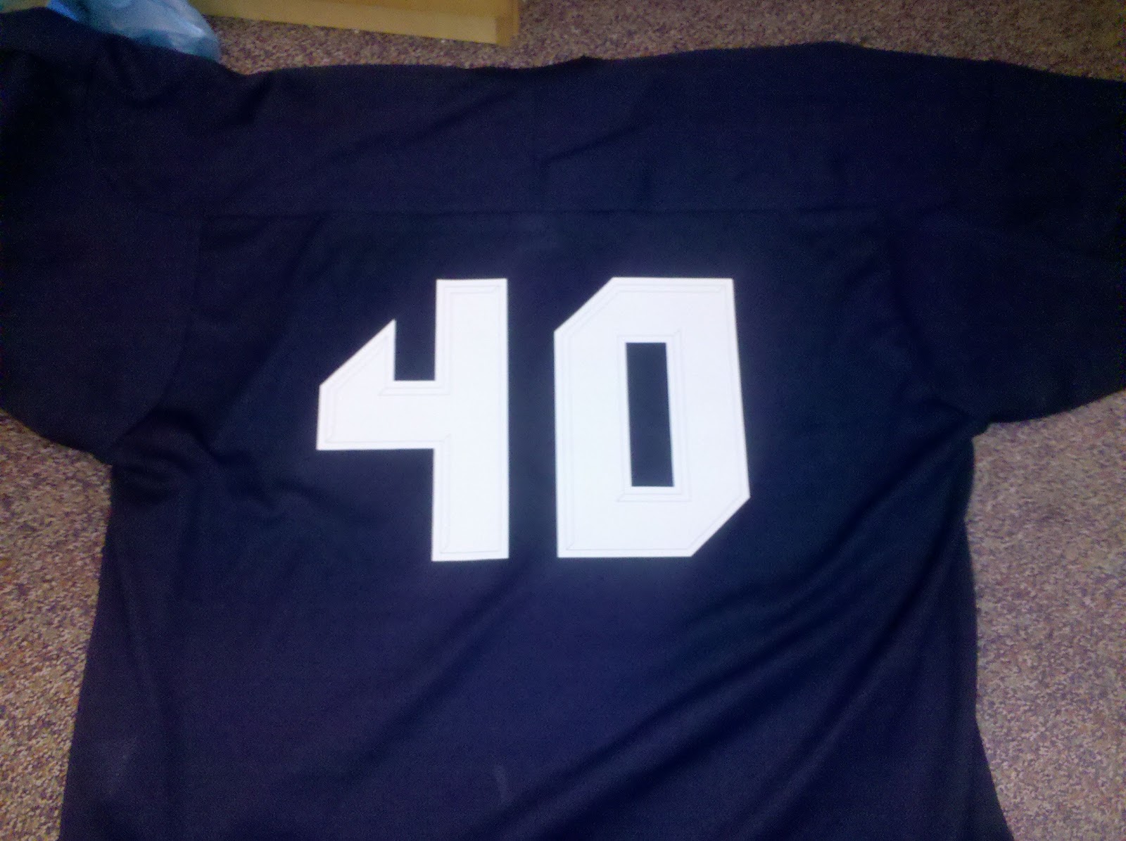
starting off with the rear templates & numbers:
this was the result:
you may remember the number font i created for a different project, The Crabbers:
i liked it so much, i decided to use it for this Invaders project, obviously.
for the shoulder "TV" numbers, i shrunk the font down to shoulder scale/size, and two toned it. the subtraction of lite blue makes the numbers look darker, which you may remember is the whole theme of this particular jersey.
for the shoulder patch, i had a few ideas floating around in my head. one was just the PA State Flag:
fit in nice with the jersey colors... this was also in the running:
the other two invaders jersey already had their "nod" to the great state of Pennsylvania ;-)
so i was looking for something new. something "spacey" in fact. i came up with the idea of a hockey-puck-comet-type-thing. i drew inspiration from one of my all time favorite hockey logos. the
McFarlane designed Edmonton Oilers logo:
so after a bit of AutoCAD work, and some good ol sketching:
i came up with this:
made 3 separate templates for the patch (included are the 2-tone shoulder number templates):
and this was the result:
and the front logo...
i wanted to get away from the "8 bit" video game image, but still hang onto the spirit of the Invaders. so i drew inspiration from the side of the old arcade video game machine. this was the creature we were all afraid of invading our planet:
i tried to make the logo as basic as i could so that i could just DIY it myself. but even after "smoothing" out the creature, the logo was a bit too much to handle. just past "simple" status.
involved with the effort of making this easier to DIY myself, i smoothed out the creature, and "hockeyed" him up a bit:
i wasn't too satisfied with the circular wordmark, and was trying to think of something cool to put around him. i kept repeating in my head "think of something that looks sharp." so i finally (after a few days, maybe a week, mind you), took that literally and used the image of a buzz saw blade. not only looks sharp, but gives it a "fast" feel too:
next step was to search around for a letter font that matched the number font. found one that made me more than happy, added a boarder, and came up with this:
put the creature and the font together, and came up with this:
added the buzz saw blade:
cut, trimmed, extended, cleaned, and played around with a color scheme:
you see how involved and intricate the main logo has become at this point. i was more than happy with it. so i had to call in the experts over at
Pro Knitwear Pittsburgh for help. if you remember, Pro Knitwear is the same company that made my Ryberto's patches for me:
after just a few e-mails and tweaks with each other, we came up with this stitching pattern. you'll note the 3 different stitching patterns:
this is the finished product:
centered, glued, and stitched it onto a dark navy colored jersey:
one of my best DIYs to date! fits in nicely with it's uniform set:
hope you enjoyed reading about the Invaders Dark Jersey as much as i had creating it!
also, thanks to my friend
Rob Ullman for artistic advise along the way!