Wednesday, April 27, 2011

Invaders Dark Finished:

you may have already seen this over on Uni Watch. but if you haven't, or want more detail, this is the post for you!

starting off with the rear templates & numbers:
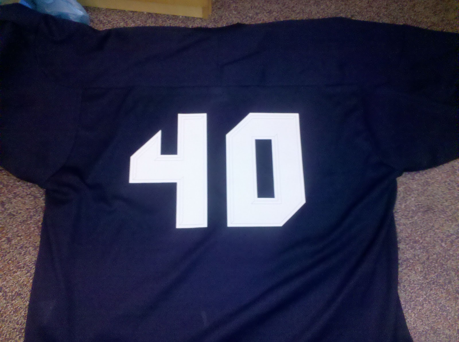


this was the result:


you may remember the number font i created for a different project, The Crabbers:


i liked it so much, i decided to use it for this Invaders project, obviously.

for the shoulder "TV" numbers, i shrunk the font down to shoulder scale/size, and two toned it. the subtraction of lite blue makes the numbers look darker, which you may remember is the whole theme of this particular jersey.

for the shoulder patch, i had a few ideas floating around in my head. one was just the PA State Flag:


fit in nice with the jersey colors... this was also in the running:


the other two invaders jersey already had their "nod" to the great state of Pennsylvania ;-)


so i was looking for something new. something "spacey" in fact. i came up with the idea of a hockey-puck-comet-type-thing. i drew inspiration from one of my all time favorite hockey logos. the McFarlane designed Edmonton Oilers logo:


so after a bit of AutoCAD work, and some good ol sketching:


i came up with this:


made 3 separate templates for the patch (included are the 2-tone shoulder number templates):


and this was the result:


and the front logo...

i wanted to get away from the "8 bit" video game image, but still hang onto the spirit of the Invaders. so i drew inspiration from the side of the old arcade video game machine. this was the creature we were all afraid of invading our planet:


i tried to make the logo as basic as i could so that i could just DIY it myself. but even after "smoothing" out the creature, the logo was a bit too much to handle. just past "simple" status. 

involved with the effort of making this easier to DIY myself, i smoothed out the creature, and "hockeyed" him up a bit:


i wasn't too satisfied with the circular wordmark, and was trying to think of something cool to put around him. i kept repeating in my head "think of something that looks sharp." so i finally (after a few days, maybe a week, mind you), took that literally and used the image of a buzz saw blade. not only looks sharp, but gives it a "fast" feel too:


next step was to search around for a letter font that matched the number font. found one that made me more than happy, added a boarder, and came up with this:


put the creature and the font together, and came up with this:


added the buzz saw blade:


cut, trimmed, extended, cleaned, and played around with a color scheme:


you see how involved and intricate the main logo has become at this point. i was more than happy with it. so i had to call in the experts over at Pro Knitwear Pittsburgh for help. if you remember, Pro Knitwear is the same company that made my Ryberto's patches for me:


after just a few e-mails and tweaks with each other, we came up with this stitching pattern. you'll note the 3 different stitching patterns:


this is the finished product:


centered, glued, and stitched it onto a dark navy colored jersey:


one of my best DIYs to date! fits in nicely with it's uniform set:


hope you enjoyed reading about the Invaders Dark Jersey as much as i had creating it!

also, thanks to my friend Rob Ullman for artistic advise along the way!

Monday, April 25, 2011

my latest entery to the clink room

for the "Night League" over at the Clink Room, and the Adobe help from Jeff Crupper, i came up with this entry.:


didn't win, but didn't really expect to. there were some really amazing entries that were much more deserving of a win!

but it would made for a cool logo nonetheless!


 wordmark:


here is an early idea for the design:


still need to type out the "Invaders Dark" post!

hope everyone has a great week, talk to you soon!

Thursday, April 21, 2011

proof it's me! haha

a few pics my mom snapped of me sewing an original Invaders jersey:


note me Mail Pouch barn in the back yard:

and a few with the Ryberto's hats:


Tuesday, April 19, 2011

messing around a bit

from New Era. part of the set up process:


all brown alt:


flirted with a gold outline:


love how this wordmark turned out:


original AutoCAD version of the hat:


'rups!

different eyes:


shout out to my favorite team:


process:

sorry for the absence...

but with NHL playoffs starting up, and a hockey trip to Columbus OH this past weekend, i just wanted to take a little break. went in lazy/zombie mode the past week, but i DID finish the Invaders Dark jersey. now i just have to write up a post for it. want to do it right though! promise to post it this week. until then, here's a fun little pic i snapped at the tournament in Columbus:

(fun sign & my bag)

and a really cool foggy sunrise pic:

(ahhh... the camera didn't do that pic justice)

Monday, April 11, 2011

couple pics from the weekend

@DJ_Byrd all the way from Vegas baby:


and beefcake TK at the Brooklyn Beefsteak (from Uni Watch):


LMAO, sorry TK! had to do it! also from TK:

Ryberto's in Times Square:


Ryberto's in the BK:


HUGE Invaders "Dark" DIY post coming up this week! stay tuned!!! until then, check out the pic TK sent from "middle-of-nowhere" USA:


TK, comment and let us know where that is...

Friday, April 8, 2011

Thursday, April 7, 2011

Pirates Home Opener!

truely one of my favorite days of the year. couldn't even tell you how many home openers i've been to in my life. just something so beautiful about this day, and this tradition. here is what i'm going with:


above: final season for the Rawlings Authentic vest before Majestic took it over (not sure of the year, help me out UW). and the Alt Hat introduced in the 2010 season...

LET'S GO BUCS!!!

Wednesday, April 6, 2011

TheBigTomProject Revisit

here's a collection of my cousin tom's pictures from the past year or so. if you haven't done so, go check out his work over at TheBigTomProject


Tuesday, April 5, 2011

Ryberto's Burritos New Era 59fifty!

the finished product:


more pics from my cousin BigTom (of TheBigTomProject (HIGHLY suggested visit to his page!))


BigTom:


Thanks Tom! and thanks to all our friends that jumped on the chance to own an authentic, limited edition, Ryberto's fitted!!!

Monday, April 4, 2011

Robert Marshall!

the man that brought us this handmade beaut:


is working on a Ryberto's version! 'nuff said!

for Robert's story, go here:


and here:


Friday, April 1, 2011

Givin' Credit where Credit is Deaux...

DON'T USE:

this crap is more like spray paint, but comes out in a stream. sucks all around!


USE THIS:

tulip brand is top notch! just don't go crazy with it. apply it with real easy controlled sprays, or else it will "blob" up and drip. understandable though, it IS paint after all.


cool posts coming up soon. new banner for the top of this page, and Ryberto's fitteds! have a great weekend everybody!